Pop art cats! I've always wanted to try this. Black and white cats have the high contrast appearance of a pop art print, so they are the perfect subject for this mini-project. I used photos of some of my cats (all past, since they are either now deceased or moved out): Boris, Olga, and Indi(go).
I followed a tutorial, which recommended using the threshold tool in Photoshop. It's more effective than the level adjustment. I also had a duplicate layer that was pixellated to get a screentone texture, but it doesn't show much (probably need to play around more with the layers and pixel size)
One weird thing I noticed was the colour difference when I switched from the main computer to a laptop. The colours on the main computer were very bright, but on the laptop, they looked washed out. I altered the pictures on the laptop to make them look bright again, but I'm still really surprised at just how different they looked. I'm beginning to see the importance of test prints.
I'm thinking that these might look nice on a t-shirt. Maybe screen printing should be my next project.
Showing posts with label art. Show all posts
Sunday, December 22, 2013
Monday, December 16, 2013
Thursday, June 20, 2013
Blue hair: Markers versus Watercolour
Markers vs Watercolours
Same painting, different media. They are both based on this photo by Miss Souls StockI did a marker version and a watercolour version so I could compare the media: their advantages, limitations, and the overall finish.
Marker
This was copied from my original sketch on to marker paper. Marker paper is very thin, so it's easy to trace on to, but you need to make sure that you are drawing on the right side. This is because marker paper has one side that is more smooth than the other, which makes blending colours easier. I often have a hard time telling which side is which. You don't have to use marker paper, but it does make blending colours a little easier.
My original lines were drawn with a Micron 005. You need to use a light fast ink when colouring with Letraset or Copic markers, because I've found that certain types of ink smear when exposed to these markers. I like to draw a thin outline to begin with, then refine it when the colouring is over with.
I have a mixture of Letraset and Copic markers. They're both pretty good. The main advantage of copics is the smaller nibs and the fact that it is slightly easier to blend the inks together.
I think its easier to use markers on larger paintings, because even the small nibs are a little large, which can make detail work difficult. If you're careful, you can minimise mistakes. Some people use white acrylic ink to fix mistakes; this can be useful, but if you make a really big mistake, you are better off correcting it in photoshop. The clone stamp can be very useful in this regard.
The colours can be a little difficult to blend if you work slowly. Even using a colourless blender I had a had time making sure the shadows didn't look to stark. I used this tutorial by Ecthelian, where you colour in the dark shadows first and fill in lighter colours later. This works surprisingly well.
It can be difficult to create the exact shade you want using markers. It is possible to buy hundreds of shades, but they aren't cheap. You may have to compromise and settle for colours that don't perfectly match your subject.
It can also be difficult to create texture using markers. They tend to create a very smooth effect which might not be what you want. You can try stippling the colour, or using pencil colours or coloured ink on top of the marker.
Watercolour
Transferring your image on to watercolour paper can be difficult. I don't recommend sketching directly on to watercolour paper, because all the rubbing out can create pencil smears and may damage the paper. I usually copy the image on to tracing paper and scribble on the back of the tracing paper with pencil. Then i place the tracing paper over the watercolour paper and draw over the lines again.
Watercolour can be difficult to use. You have to learn how much water to add to the paint, and how long to allow it to dry. I recommend 'Animals in Watercolour' by Sally Michel and 'Mastering the Art of Watercolour' by Wendy Jelbert and Ian Sidaway, and Jenny Dolfen's tutorials.
It can be difficult to create intense colours with watercolour. i use Ecoline if I want a very intense shade, but be careful because the Ecoline can clash with the rest of your paints by looking too bright.
One big advantage of watercolours is that you don't need a lot of different colours. You can mix most of them out of a basic colour palette. The paints also tend to be cheaper than markers, depending on the brand you buy. I like Windsor and Newton, but I'm also using some random paints I got about 10 years ago, and even poster paint.
Another advantage that they have over markers is that they blend more easily. The finished painting looks more 'subtle' or 'soft' than a marker drawing. You may also be able to create more effects with them e.g. adding salt to wet paint creates a gorgeous blotchy effect, though I have heard that adding a little surgical spirit to markers with a cotton bud produces interesting results.
Unlike markers, you may find you have less portability when using watercolour. You need a container for water and a variety of brushes, and perhaps an easel. They can be great for working in pleine air, but you have to take into account the drying time.
So, to summarise:
Watercolours: cheaper, easier to blend, difficult to get very bright shades, drying time, different effect, softer finish
Markers: brighter colours, dry quickly, easier to transport and use, usually a bold finish but a skilled artist can create a more subtle look (like this)
Wednesday, May 29, 2013
Touch the Sky
Finally, a proper painting! Woohoo! I saw Brave recently a really liked it. Cue fanart of Merida and Angus.
Here's the sketch. I altered it quite a bit, because Merida looked too large for the horse. I initially drew this on an A5 sketchbook, then used a photocopier to make it A3 size: I did most of the alterations on the A3.I did the background first, mostly using a mix of Payne's grey, cadmium yellow and lemon yellow, with a little scarlet and crimson thrown in. I wanted a very subtle sunrise.
Merida's hair was a lot of fun to paint: just a mix of vermillion, orange made of cadmium yellow, yellow ochre, sienna and scarlet, and some burnt sienna for shading. I also used aquarelles.
The horse took forever. I needed at least 9 coats of paint to get such as deep shade of black. The black is made of Payne's grey and a very dark brown paint.
The grass in the foreground was last. I used every shade of green on the palette, plus a few that I'd mixed. I didn't define every blade of grass, because I wanted it to look a bit loose.
Here's the scanned image. It didn't really capture the colours of the original image: they're much more subdued in real life.
Friday, February 1, 2013
Art: By the Sword: A work in progress
Just to prove that, occasionally, I still paint and draw. A few years ago, I found a tutorial by Jenny Dolfen, where she painted a picture with black watercolour, scanned it, and used photoshop to add colour. I really wanted to the method, so I painted this (based on a photo of a friend of mine at Medieval Mdina), and am slowly painting it.
The method involves creating new layers on top of your watercolour, and setting them on either 'color' or 'overlay'. This helps you to retain the brushstrokes and texture of the paint. So far, I've only laid down the base colours, and need to do some more detailed shading e.g. the blush of her cheeks, add some more greens and yellows to the dress. If any of you watchers are good with Photoshop, i would love to hear your advice. Also, the tutorial I based this on doesn't seem to exist any more-does anyone know where I can still find it?
I also did a few fashion drawings a few months ago. I don't know whether I uploaded them, so here they are.
A Batman themed dress. I have the material to make the black one, and it's available as a custom made item on etsy.
This is a Harley Quinn themed dress. I haven't put the dress up for sale on etsy because I'm still not sure what material would be best for this dress.
Monday, November 5, 2012
Pilot is coming
I forgot to mention this in my last journal, but Malta Comic Con 2012 marks the release of the second issue of Pilot!
What is Pilot?
Pilot is a brand new comic anthology. It began between a few local artists, starting as what felt like an idle day dream of self publishing, before it gathered speed and took life of its own. Our aim is to promote the local comic art scene, and to promote comics as an art form in Malta. Comics are sorely under-appreciated in Malta, often viewed as childish stories and not 'true art': we would love to show that comics can and do constitute 'true art'. Pilot isn't restricted to Malta: it will be published in English, so as to reach out to the international scene.
The title has a double meaning. The name 'Pilot' was inspired by 'Flight', a well established, not to mention award-winning, comic anthology. The name also refers to the fact that this anthology is a pilot production: the first of its kind in Malta.
Many of the contributors to Pilot are students. While we contribute as much as we can to the project, we have our financial limitations.
The profit we make from selling the comic goes right back into funding Pilot. We make no personal gain from our work.
This year's theme is Medieval , and Pilot's pages will be full of knights, witches, hunters, harts, maidens, lions, and unicorns. If you want a glimpse of things to come, have a look at the Pilot facebook page http://www.facebook.com/pilotcomic?fref=ts There's some amazing stuff by :deviella: and :devta-min: among many other talented artists, and tons of page previews and concept art.
So if you come by Malta Comic Con this year (8/9th December) please come to the Pilot stand to check it out. And who knows? You might get to see me in appropriately Medieval dress http://maltacomic-con.com/artist/20/malteselizziemcgee-liz-mallia
Monday, September 17, 2012
Draw This Again
Deviantart is holding a contest called 'Draw This Again'. The idea is to take an old piece of art, and to redraw it.
I chose to redraw this painting, entitled 'Masquerade'. I used acrylic paints on cartridge paper (the background was done with tea). I still like it, but it's not my best piece: the eye and mane are sloppy.
Here's the revamped version. I sketched this in ink, and scanned it. My tablet came in very handy for colouring it in.
If you'd like to comment on the picture, go to my deviantart page http://malteselizziemcgee.deviantart.com/#/d5f0oqx
I chose to redraw this painting, entitled 'Masquerade'. I used acrylic paints on cartridge paper (the background was done with tea). I still like it, but it's not my best piece: the eye and mane are sloppy.
Here's the revamped version. I sketched this in ink, and scanned it. My tablet came in very handy for colouring it in.
If you'd like to comment on the picture, go to my deviantart page http://malteselizziemcgee.deviantart.com/#/d5f0oqx
Tuesday, July 10, 2012
Spirited Away
I had the time to work on some art (working on my portfolio), and decided to do some Spirited Away fan art. I watched the film again about a month ago: I'm amazed at how much I managed to forget (like the train, and Zaniba's seal)
The background was created by covering a piece of watercolour paper in washes of sepia ink, and leaving it to dry. This creating a sort of parchment effect.
Next, I photocopied my sketch, enlarging it to the size I want, scribbled on the back with a pencil, then transferred the picture by drawing over the lines of the photocopy with a biro. The photocopy was taped over the watercolour paper, so drawing over the lines replicated the image on to the watercolour paper.
I made the lines on the watercolour paper more visible by drawing over them with pencil, then started colouring.
To do Chihiro's face and arm, I first had to paint over them with white ink. Once the ink dried, I used water soluble pencils to get the right colour for her skin. Her blushed cheeks were done by dropping a pink/red mix on to the wet paper.
I then painted her apron with white ink, waited for it try dry, and added shading. I then painted her pink uniform, and her hair. Her hair took a while: I ha to paint the lighter brown, wait for it to dry, then shade it with sepia watercolour, in order to get a look similar to cell shading.
Haku was next. All the white parts of Haku's body had to be painted with white ink/watered down acrylic, left to dry, then painted over with watercolour and water soluble pencils to get the right look.
Haku's mane was created by colouring it in with blue and turqouise water soluble pencils. I painted over these with water to make the colour brighter. Once the right colour had been achieved, I mixed up a dark aquamarine, and used it to paint the shadows.
The background was created by covering a piece of watercolour paper in washes of sepia ink, and leaving it to dry. This creating a sort of parchment effect.
Next, I photocopied my sketch, enlarging it to the size I want, scribbled on the back with a pencil, then transferred the picture by drawing over the lines of the photocopy with a biro. The photocopy was taped over the watercolour paper, so drawing over the lines replicated the image on to the watercolour paper.
I made the lines on the watercolour paper more visible by drawing over them with pencil, then started colouring.
To do Chihiro's face and arm, I first had to paint over them with white ink. Once the ink dried, I used water soluble pencils to get the right colour for her skin. Her blushed cheeks were done by dropping a pink/red mix on to the wet paper.
I then painted her apron with white ink, waited for it try dry, and added shading. I then painted her pink uniform, and her hair. Her hair took a while: I ha to paint the lighter brown, wait for it to dry, then shade it with sepia watercolour, in order to get a look similar to cell shading.
Haku was next. All the white parts of Haku's body had to be painted with white ink/watered down acrylic, left to dry, then painted over with watercolour and water soluble pencils to get the right look.
Haku's mane was created by colouring it in with blue and turqouise water soluble pencils. I painted over these with water to make the colour brighter. Once the right colour had been achieved, I mixed up a dark aquamarine, and used it to paint the shadows.
Friday, June 15, 2012
Book binding
Nearly done with exams, so I've had time to bind some sketchbooks. I learnt to bind using the coptic stitch a few months ago, and the result is really neat.
Three of the books are covered in marbled paper, one is covered in the remains of some of my A'level art paintings. I used different types of paper: one book has thin drawing paper, others have off white thin paper.
Saturday, April 21, 2012
Watercolour Progress: Leaves
I'm planning to upload pictures of my Arwen costume in action at Medieval Mdina soon. Until then, enjoy these progress pictures of a watercolour painting I've been working on.
I based the painting off a stock image from deviantart. I sketched out the picture, and photocopied it, enalrging the image to A3 size. To transfer the sketch to the watercolour paper, I covered the back of the photocopy with charcoal, taped it over the watercolour paper with masking tape, and drew over the outlines with a dull pencil. The watercolour paper is one of two large sheets I bought about 2 years ago.
The paper is very thick (almost as thick as cardboard,) cold pressed, with a slight texture on one side. It is very durable, and doesn't warp too much (it did stretch a little under the background washes)
I've painted the background and her skin. The red blobs on her face are meant to be blush: they dried much lighter and less blotchy looking.
Lips are done. I used ecoline watercolours to paint them: they are extremely bright. Also added the first wash for the hair.
Her hair's all done. More ecoline: it is so vivid! Her eyes are done too, and I've started the leaves.
Almost done, needs to be scanned and pieced together in Photoshop (I will have to scan it in two parts, because it is bigger than my scanner bed). I made the background darker, and added texture with salt and surgical spirit.
I based the painting off a stock image from deviantart. I sketched out the picture, and photocopied it, enalrging the image to A3 size. To transfer the sketch to the watercolour paper, I covered the back of the photocopy with charcoal, taped it over the watercolour paper with masking tape, and drew over the outlines with a dull pencil. The watercolour paper is one of two large sheets I bought about 2 years ago.
The paper is very thick (almost as thick as cardboard,) cold pressed, with a slight texture on one side. It is very durable, and doesn't warp too much (it did stretch a little under the background washes)
I've painted the background and her skin. The red blobs on her face are meant to be blush: they dried much lighter and less blotchy looking.
Lips are done. I used ecoline watercolours to paint them: they are extremely bright. Also added the first wash for the hair.
Her hair's all done. More ecoline: it is so vivid! Her eyes are done too, and I've started the leaves.
Almost done, needs to be scanned and pieced together in Photoshop (I will have to scan it in two parts, because it is bigger than my scanner bed). I made the background darker, and added texture with salt and surgical spirit.
Wednesday, April 11, 2012
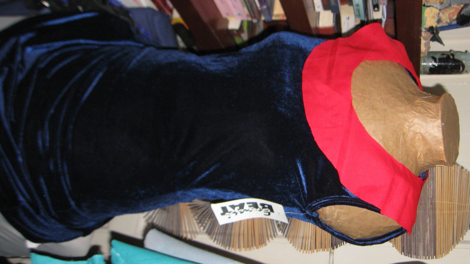
Arwen Update
| Draping the neckline |
| Why does blogger always rotate my images? |
| Sleeve detail. This is the part of the sleeve that wraps around the elbow. |
I also found time to make a new sketchbook. I sometimes recycle the scraps of paper I have lying around by binding them into a book. It involves sewing them together with dental floss, lots of glue, and decorating them. Decorating is one of the best parts of the process. I've been reading A Song of Ice and FIre, and decided to do a Stark themed cover.
The paper is an old painting from my A'levels. THe material on the spine is cotton, painted with acrylic to match the dire wolf's head. I'm considering offering custom sketchbooks/notebooks.
Thursday, March 22, 2012
Unicorn and Maiden Art
Since my art blog is much neglected, I'm uploading art to this blog instead. This is concept art for a short story which will become a comic. The comic will hopefully be accepted into the second issue of the Pilot anthology. I'm trying a stylised look, partly inspired by Gunnerkrigg Court (which is a fantastic series-look it up!)
The unicorn is based on an Arabian horse in most of these pictures, except for the blue one at the top: that one is based on a horse featured on Fugly Horse of the Day, of unkown breeding. Personally I thought he was cute, though with poor conformation.
Friday, August 27, 2010
Bodice 98% done, and t-shirt designs
The bodice of my Violet costume is nearly done, it just needs eyelets and lacing. The overskirt, the sleeves and the undershirt need to be done. I am not looking forward to all those pleats. I've found 10 metres of eyelet tape that I'll be using for the overskirt: it's the wrong colour, but it's easily dyed: it will save me so much work. Putting in eyelets is a tedious job, and I like to avoid it wherever I can.
I've been making accessories in prepartion for Comic Con or any other event where I can sell things. I'm considering creating an Etsy account.
T-shirt designs are going very well. I have a bunch of t-shirt waiting to be experimented on, and I've drawn up a few designs.
I think these are a lot better than anything I've drawn before. I like 'Kickass Bunny' because it oculd make a good series of designs. Butterfly Eyes is more artsy, but from all the t-shirt designs I've been staring at over the past few months, that should be fine. YEs, I have been staring at t-shirt designs: I walked into a shop that bought most of its stock from Ironfist, and the t-shirts there are fabulous, though expensive. One thing I would like to try making is this Ironfist hoody: 
I think these are a lot better than anything I've drawn before. I like 'Kickass Bunny' because it oculd make a good series of designs. Butterfly Eyes is more artsy, but from all the t-shirt designs I've been staring at over the past few months, that should be fine. YEs, I have been staring at t-shirt designs: I walked into a shop that bought most of its stock from Ironfist, and the t-shirts there are fabulous, though expensive. One thing I would like to try making is this Ironfist hoody:
It would be a really fun challenge, though I'll ater the design from the original. There's also a t-shirt version that will be fun to try. Ironfist's t-shirt (and hoody) designs are some of my favourites. Actually they do great designs for most of their line: a personal favourite is a bikini featuring a monster's eyes and mouth.
For some reason I really want to draw a mechanical spider design. I've probably been to Zara too many times.
Subscribe to:
Posts (Atom)